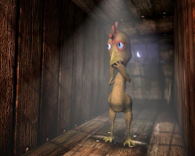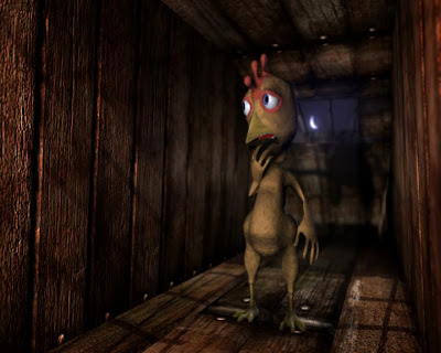
here i tried putting some sort of spot light fixture in the coop, I do not like this at all.

In this one I have a very strong red area light linked to the front slats on the coop, this definitely brings out the character more but ideally a change in the textures would help. We have tried a yellow texture on the chicken as we said we could do earlier and it looks rubbish and gets lost when we aply a straw texture to the base of the coop. I have suggested a white or paler texture to the chicken but Luke seems adoment that he wants to keep it brown. This is a problem because its quite hard changing the colour of wood to anything but brown....